Cập nhật lần cuối vào 23/05/2021
From March 1, 2021, the Student Employment and Experience Center (HIU Student Center) officially launched a new uniform and brand identity after 3 months of establishment on the basis of merging the Student Experience Department and the Student Experience Department. Center for Entrepreneurship & Business Relations (November 1, 2021).
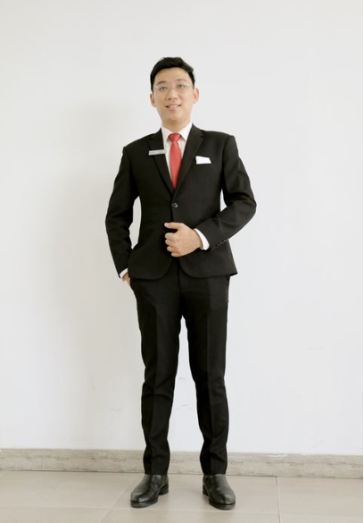
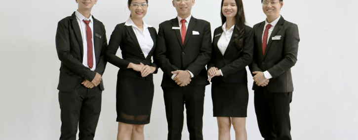
With a new development orientation with 3 main pillars including diverse and interesting experience activities, students’ career opportunities and dedicated care are an integral part of the overall. Development of the School and HIU Student Center as a nucleus. Therefore, the uniform of HIU Student Center is used with 3 main colors based on the brand identity color of HIU – Hong Bang International University, which is red next to the two basic colors black and white, creating a simplicity and harmony of HIU Student Center in the overall school. HIU Student Center uniform with luxurious and elegant suits suit
In an international environment, in harmony with the flow of comprehensive upgrading of service quality and student care at Hong Bang International University, HIU Student Center’s uniform is the perfect combination of vest and skirts create aristocracy for female professionals besides male professionals in black and white suits and red tie creating simplicity and elegance. The style and color of the costumes create similarities and links between the members, the department is completely compatible with the identity and creates the unique color of HIU Student Center.


In addition to the suits for male and female professionals, it creates an elegant and aristocratic international class of the team of experts. HIU Student Center also has a bright, lucky and dynamic red T-shirt that is used every Monday and Thursday to create positive energies for the whole working week. With a red t-shirt combined with a black skirt for women and black casual pants neatly packed politely, exuding a healthy, fresh, dynamic and youthful appearance.
From the slogan “Know students best" to improving the quality of student service
For T-shirts, the slogan “Know Students Best" is on the back as a guideline to remind the staff to always look towards students, empathize with and share with students, and wholeheartedly support students. students, always accompany and bring the best to HIU students’ learning process and after graduation
HIU Student Center logo not only carries brand identity value

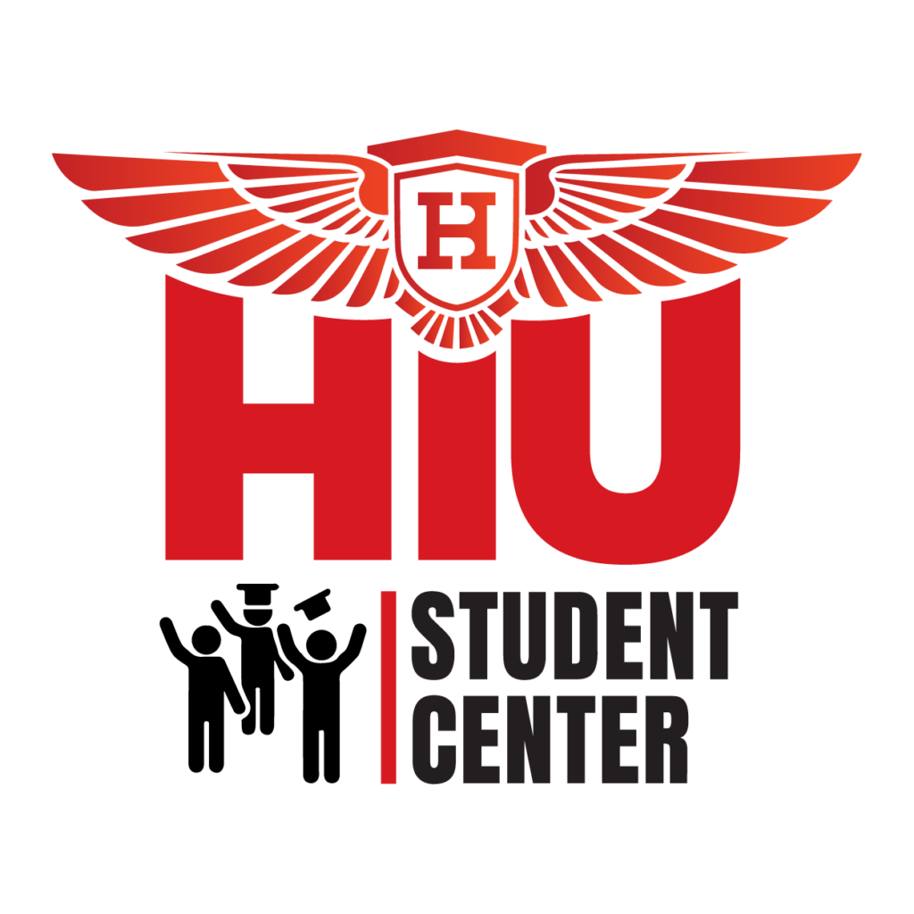
With the motto: fast – strong – sure in student activities, the logo of HIU Student Center is created from the stylized but harmonious combination of the eagle symbol and the abbreviation of the school name “HIU" together with the name “HIU". images of students and learners beaming on the day they received their diplomas. In addition to the role of brand identity, the HIU Student Center logo (officially put into use since December 2020), also plays the symbolic role of accompanying students in all aspects of activities.
Especially, for T-shirts, the HIU Student Center logo is solemnly placed on the left chest to match the heartbeat, always reminding each member of their dedication to work and always accompanying the memories. happiness and sadness of students HIU
Each staff member and specialist when wearing HIU Student Center’s uniform will be professional and friendly ambassadors for the Center’s image with the mission of providing the best services of international standards, taking care of students effectively. and at the same time spreading the beautiful values that bring to students the experience of studying at Hong Bang International University.

